When The Woodruff Institute’s partners purchased a former office space for its new flagship Naples location, they wanted a comforting, high-end spa feel for their dermatology and skin care clients.
Working with Coffman Design Group and PBS Contractors, the doctors achieved that—the nearly 10,000-square-foot space at 1333 Third St. S. in the Bayfront Professional Building won the CBIA’s 2022 Sand Dollar Award for Best Healthcare Facility in the $1 million to $3 million range. Now Coffman and PBS are designing a 2,500-square-foot expansion, two suites the doctors had planned to rent out, but will use to expand the call center and exam rooms.
Doctors Jonathan Sonne, Kathryn Russell and Rebecca Lambert, as JKR Bayfront LLC, purchased the second floor of the Bayfront Office Center in December 2019 for $3.9 million and hired interior designer Jerry Coffman to redesign the 42-office administrative center. PBS, which had extensive clinical experience, started the $2 million construction project by gutting it.
“We had a blank template to work with,” says Andy Reed, PBS’s relationship manager for the project. “The space exceeds high-end, high-volume clinical practices. It’s reflective of their patients, the community and what’s expected from a top-tier provider.
“Our strength, especially during COVID, was negotiating good prices with trade partners and giving guidance on the pricing structure,” he adds, noting that many suppliers weren’t local and some were overseas, making them more susceptible to supply-chain constraints.
The practice specializes in medical and cosmetic dermatology, Mohs surgery, laser treatments, body contouring, skin services and spa services. The doctors wanted a grand entrance, as well as retail areas for skin care products, hats and clothing.
“They wanted to highlight the products they have and make them easily accessible for patients to peruse without being exposed to patients entering and leaving,” Reed says, noting that patient privacy was important, and patients can leave after a procedure without going through the waiting room.
The partners also wanted a high level of comfort, high-quality finishes and fixtures and easy access, especially for patients with mobility issues or who aren’t fully healed.
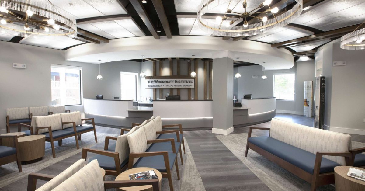
The main reception area features 18 large translucent ceiling lighting panels, four chandeliers and 10 wood beams, a refreshment station and retail space. Seating provides pops of denim blue interspersed with calming grays on the walls, carpeting and wide-plank floors. Warm wood tones abound.
“We wanted a soothing, spa-like atmosphere to ease patients’ concerns,” says designer Jerry Coffman. “They’d also just reworked their logo and we wanted to work with that.”
As a result, touches of red appear in ceiling baffles, dividers, chairs and shelving.
Lab rooms, where chemicals are used, feature non-slip Sika flooring. Exam rooms were strategically placed to treat up to 228 patients daily. An aesthetician station, where demonstrations and products can be tested during private sessions, is at the center of 14 exam rooms and is highlighted by a mosaic mural and a copper and silver chandelier.
Grays and pastels were used to create a modern coastal look that was cozy and homey, said Kevin Macatangay, Coffman’s project manager, who ordered the many unusual, contemporary lighting fixtures from Lighting First in Bonita Springs.
“I wanted something different, decorative and functional,” he says, adding he used LED strips to highlight products on shelves and avoided traditional office lighting throughout.
There are 96 ceiling panels in the triage-administrative spaces, while the main conference room ceiling features 69 wooden slats and 22 leaf-shaped lighting fixtures arranged like a honeycomb. Fort Myers photographer Jesi Cason’s black-and-white photos of happy faces line a hallway.
Linear wood beams on ceilings are a motif throughout. Armstrong beams and acoustic baffles absorb noise, as does carpeting, which was crucial in a call center for Woodruff’s four locations. Its large windows provide lots of light, while above, red-and-white acoustic baffles mirror red desk dividers. The area also features four large management offices with floor-to-ceiling glass doors and windows.
The designers took the break room ideas a step higher, creating a beautiful cafe and a full-service kitchen with state-of-the-art appliances, including two refrigerators, two microwaves and a Miele espresso machine. Red accents, metallic pendant lights and chandeliers increase the wow factor.
“It started to look more like a restaurant, so I rolled with that idea,” Macatangay says of the bar-height seating, tables, benches and chairs. “We wanted two of each appliance so no one was kept waiting.”
Woodruff’s Practice Administrator Rachel Coughlin says it was a long process. “We had a wish list, there were several designs and we narrowed it down to this one,” she explains. “The employees love it.”


